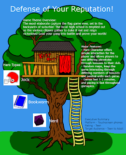
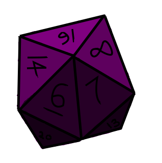
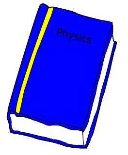

This is the Treehouse with some shading. I have also added 3 of the icons that were made by Jack. I only have 3 of his line drawings and I am running out of time. So, it looks like we will have 3 icons and the Treehouse.
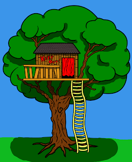
This is the Treehouse with some color! I feel like I should do some lighting and shading. Let me know of any suggestions to improve this!

This will be updated with the graphics to be used in our first high concept sheet. I know a few of you wanted to see updates as I transform sketches into lineart, so rest assured, work is happening.
 | |||
| Original photograph of a tree-house, which will be used as a primary focus in our high concept |
 |
| Work in progress update of the lines associated with the above image |
I'm unsure about the styling of the image, but seeing as how the point of no return was passed by a few hours ago, we'll take it to the end and decide how we want to proceed in the future should we keep this concept for the final game. Sketching trees or doing a full pencil piece seems a lot easier than trying to line them and still maintain their sense of inner tree-zen. We live and we learn!
Edit: We have a finished tree house! There are a few areas of improvement on its aesthetics, but I think it's sufficient for the task at hand. Andddd here are some icons...


I like what you have done so far! I think it has what we are looking for! Let me know if you need help coloring!
ReplyDeleteNice finish!
ReplyDeleteI should be able to post the last two icons by tomorrow morning - stay tuned.
I would be soooo pleased if you could do the coloring, Max. I'm burned out from all these lines haha. Also, I'm not sure I'll get through all of Jack's icons tonight... I will post what I finish, and anything else we would like to add to the presentation could be managed by someone else.
ReplyDeleteOkay, so I have the icons completed. I'll call it a day today.
ReplyDeleteI think I'm done for the night as well. Feel free to line other sketches for coloring, Max. If you haven't by tomorrow evening, I might still do a few more, but I recognize that cuts time short for color and layout.
ReplyDeleteHey, I'm still unsure about the text we need on this. Could we get a discussion going about what we want on the poster?
ReplyDeleteWhen you mean poster do you mean the One Pager?
ReplyDeleteYep. Sorry about the paraphrasing, I'll try to be more clear.
ReplyDeleteNo worries, i was just getting nervous I forgot something. It looks like Marty posted his slides on the dropbox if you want to look at those. We need to have key game features and an executive summary. This will include stuff like multiplayer, AI, High def graphics, etc... Executive summary has stuff like platform target, price, genre, etc.
ReplyDeleteShould I type the features and summary up?
ReplyDeleteIn response to the colored treehouse, I would definitely add some cell shading or something else to create depth if possible.
ReplyDeleteAs for the text we have prepared, maybe you should quote what you already plan to add on the iteration post so that people can provide input or more information?
I just got back from work. I guess I will compile the information give with the graphics I have. Is that optimal?
ReplyDeleteThe final piece looks pretty good. Thank you to everyone who contributed. I agree that delegation needs improvement in the future; my work took about seven or eight hours, which simply isn't plausible most days. We'll have to talk about it in class... We should also be seeing more input from the full team here on the blog, so that's another thing to encourage when we next meet.
ReplyDeleteLooks great! I feel like I could have done more, and I think that our communication needs improvement too. Thanks for your hard work everyone!
ReplyDelete