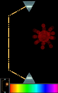
Here is a "Screenshot"

Where you thinking of something like this for the UI?
Deployment is managed with a spectrum of colors that fills the bottom two centimeters of the screen. (roughly) Touching this spectrum and then sliding up or down on a slider that is vertical allows players to choose a point on the screen where the light is diffused. (Deployment can be hindered with a cooldown) The two sides of the prism shown can deploy units and a tilt can be used for deciding where units are deployed.
The yellow line represents unit movement, (Always towards the enemy) with the dashes representing diffused locations of wider and dimmer light. The solid line represents focused light. A unit should take 3 seconds to reach the other side
Combat is collisions of the players light beams, and this is where diffused (Representing 4hp) and focused beams (6 hp) are important. Collision of two diffused or focused beams results in both destroyed, collision of a diffused and a focused results in a cut through the diffused beam and half damage (3hp) to the focused beam. The diffused parts of the beam continue moving forward with 1hp.
Unit differences are divided between the fourths of the spectrum. The first fourth have no special qualities, the second fourth survive diffused vs. diffused combat with 1hp, the third fourth of the spectrum survive focused vs. focused with 1hp, and the last group survives the point defense lazer with 1 hp. Also the higher bands could move faster or have higher hp.
The red burst on the right is an example of a fully charged lazer blast. Dealing 6 hp damage to all units within its radius. There are three charges to the lazer, with 1, 3, and 6 hp damage. The first charge is merely tapping the screen. The second charge would take about 1 second to charge and would be half the size of the lazer burst shown. (For diversity the lazer levels could be swapped with abilities like mirrors, towers, lines, and changing your units stats/appearance)
A non-defended game where one player is attacking should last 15 seconds. The mix of unit defense and player defense should keep most games at 1 to 2 minutes.
Hope that explains it well! Post your questions and improvements!
We will just need to resize them to fit into the mockup.


Hayden, can you send me the .xcf file of your light game? I want to play around with how it looks.
ReplyDeleteHayden, let me know of anything I can work on. I am feeling a bit lost with your game. Your picture looks great! I feel like there is not much to cobble. The only thing I was going to try to do was to add space for your UI, but I am not sure how you wanted it to look. Also, I was going to place your picture over an android phone to give some perspective.
ReplyDeleteNo problem, I'll ge that file to you and I was thinking that the UI would be just the slider and a spectrum set in the bottom of the playing field below the prism.
ReplyDeleteI'm Still looking for the right effects look. The units need to look like comets, with tails and bright points at the end. It would be cool if they created spots of light in their color that color the field too.
I feel like I understand the game concept pretty well, but I'm not sure I'm a huge fan of how the light deploys at an angle from the prism, or how it angles back inward at the opponent. It seems more effective to have them being issued outward (or at least only hitting) flat surfaces, and to me it seem more visually appealing.
ReplyDeleteI was using the angle to make it easier to defend, with that sharp turn you know when you have to do something. Anything is possible at this point, so sketch up something and we'll vote on which is more appealing.
ReplyDeleteI am still having a difficult time understanding the strategy for unit deployment. I feel like it is going to be difficult to pinpoint where you want them to be by using the touchscreen. The window seems too small for fingers and if it gets bigger, than it will take up too much of the screen. Please let me know if my picture I submitted needs fixin.
ReplyDeleteRecoloured expolsions uploaded.
ReplyDelete